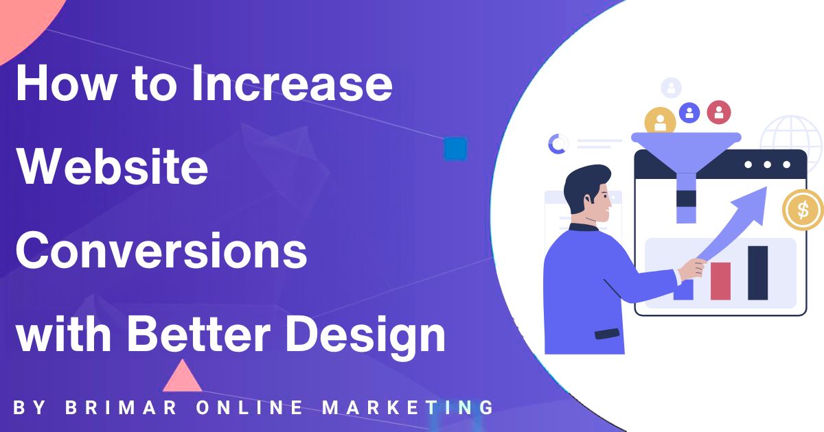
Your website might be getting a steady flow of visitors, but are they taking the actions you want them to?
Whether signing up for a free trial, purchasing, or filling out a contact form, a well-designed website can make all the difference.
Design isn’t just about aesthetics; it plays a crucial role in conversion rate optimization (CRO) by guiding visitors toward specific actions.
A better user experience (UX design) helps visitors navigate effortlessly, find what they need, and trust your brand enough to convert.
Minor tweaks, like faster page load times, mobile optimization, and strong call-to-action (CTA) buttons, can significantly improve your website’s conversion rate.
But how do you know what works?
That’s where A/B testing and data-driven decisions come in.
By testing different designs, analyzing user behavior, and tracking conversion funnel data, you can refine your website for better results.
Let’s break down how website design impacts conversions and explore best practices for creating a high-converting website.
Understanding Website Conversions and User Behavior
A website conversion happens when a visitor completes a desired action, such as signing up, purchasing, or clicking a button.
Your website conversion rate measures how many visitors convert compared to the total number of visitors.
A low conversion rate means something isn’t working, and design is often the culprit.
Get a FREE Website Consultation
Let us take care of your web design and development needs so you can focus on your business. We can handle new websites, landing pages, website redesign, and even maintenance.
Contact us today to get a free website consultation!
How User Behavior Impacts Website Conversions
Visitors make snap judgments.
Within seconds, they decide whether to stay or leave.
The layout, navigation, page speed, and overall UX design influence their decision.
They’re likely to leave if they encounter confusing navigation, slow load times, or cluttered pages leading to high bounce rates.
Here’s where visual elements and interactive elements come into play.
A website that guides users smoothly, provides necessary information without overwhelming them, and uses trust signals like customer reviews and security badges builds confidence and encourages conversions.
Common Reasons for High Bounce Rates
- Slow page speed: If a page takes too long to load, visitors won’t wait.
- Poor mobile responsiveness: If a site isn’t optimized for mobile users, it drives them away.
- Unclear navigation: If users struggle to find what they need, they leave.
- Weak CTAs: If CTA buttons don’t stand out or use vague wording, users won’t click.
- Lack of trust signals: A site without social proof, customer reviews, or security badges can seem unreliable.
Improving UX design, reducing friction, and clarifying specific actions create a seamless experience that keeps visitors engaged and moving toward conversion.
The Most Important Design Elements for Better Conversion Optimization
Some design elements have a significant impact on conversions.
These are the building blocks of a high-converting landing page that attracts visitors and compels them to take action.
Clear and Compelling CTA Buttons
Your CTA buttons are what drive conversions.
If they blend into the background or have weak messaging, they won’t work.
To make them effective:
- Use contrasting colors to make them stand out.
- Make the wording specific and action-oriented (“Get Your Free Trial” is better than “Submit”).
- Place them above the fold and repeat them throughout the page.
- Ensure they are mobile-friendly and easy to tap.
The Power of Negative Space (White Space)
A cluttered page overwhelms visitors and makes it hard to focus on what matters.
Negative space (also called white space) gives your content breathing room, making it easier to read and navigate.
A clean, well-spaced layout helps guide the visitor’s eye toward important information, like CTAs and trust signals.
Using Contrasting Colors to Guide Actions
Colors aren’t just about branding; they influence visitor behavior.
Contrasting colors can:
- Make CTA buttons pop.
- Highlight important information without overwhelming the page.
- Create a visual hierarchy that guides users smoothly through the page.
The Role of Visual Elements in Building Trust
People connect with visuals faster than text.
High-quality product images, human faces, and trust signals like security badges and customer reviews make your brand more relatable and credible.
- Human faces create emotional connections. A smiling person using your product feels more inviting than a plain stock image.
- To build confidence, product images should be high-quality, zoomable, and show different angles.
- Trust signals, like customer reviews, social proof, and security badges, assure visitors that they make a safe choice.
Interactive Elements That Engage Visitors
Adding interactive elements like AI chatbots, live chat, or session recordings keeps visitors engaged and helps them find answers quickly.
When users feel supported and guided, they’re more likely to convert.
Focusing on these key design elements can create a conversion-optimized website that improves user engagement, builds trust, and increases website conversions.
Next, we’ll dive into mobile optimization, A/B testing, and more best practices to fine-tune your site for even higher conversion rates.
Building Trust with Social Proof and Customer Reviews
Trust is everything to get visitors to take action on your website.
If people don’t trust your business, they won’t sign up, buy, or even stay long enough to consider it.
That’s why trust signals like social proof, customer reviews, and clear contact information can significantly affect your conversion rate.
How to Use Social Proof the Right Way
Social proof isn’t just a marketing tactic; it’s human nature.
When people see that others have had a positive experience, they feel more confident doing the same.
The best way to leverage social proof is by integrating it naturally throughout your website.
Place testimonials near key decision points, showcase user-generated content on product pages, and highlight customer reviews where they matter most.
Why Customer Reviews and Positive Feedback Drive More Conversions
Reviews give potential customers the reassurance they need before deciding.
A well-placed five-star review or a quote from a happy customer can decide for someone on the fence.
The key is to display these reviews where they impact product pages, pricing sections, and checkout pages.
Businesses with more positive reviews see higher conversions because they address common pain points before they arise.
If a customer worries about product quality, a glowing review about durability can ease that concern.
If shipping speed is a common hesitation, showcasing feedback that praises fast delivery can turn hesitation into action.
The Power of Security Badges and Contact Information
Trust isn’t just about what others say; it’s also about how transparent your business is.
Displaying security badges, like SSL certificates and payment security icons, assures visitors that their information is safe.
Including contact information, like a phone number and email, adds credibility.
People want to know they can contact you if necessary, and a visible contact method makes your business feel real rather than just another faceless website.
Case Studies: How Trust Signals Increase Conversion Rates
Businesses that actively use trust signals see a noticeable improvement in conversions.
A well-known online retailer tested adding verified customer reviews to their product pages and saw a 25% increase in sales.
Another company added a security badge to its checkout process, reducing cart abandonment by 18%.
If visitors aren’t converting, look at your trust signals.
Are you providing enough proof that others trust your business?
Are your contact details easy to find?
Small changes can make a significant impact on your website’s conversion rate.
Mobile Optimization: A Crucial Factor for Website Conversions
People spend more time browsing on their phones than ever before, which means your website needs to work just as well if not better on mobile devices.
If your site isn’t mobile-friendly, you’re frustrating visitors and losing potential customers.
Why Mobile Responsiveness Matters
A website that adapts seamlessly to different screen sizes provides a better experience.
No one wants to pinch, zoom, or struggle to tap a button that’s too small.
When navigation is smooth, content is easy to read, and pages load quickly, visitors stay longer and are more likely to act.
Responsive design isn’t just about looking good, it directly affects website conversions.
If a potential customer lands on a poorly optimized site, they’ll leave within seconds.
But if they can browse effortlessly, they’ll engage more, increasing the chances of conversion.
Best Practices for Mobile Users
Making your website mobile-friendly isn’t just about shrinking the desktop version.
It’s about designing with mobile users in mind.
That means:
- Mobile-friendly CTA buttons: Buttons should be large enough to tap easily without zooming in.
- Simplified navigation: A cluttered menu is frustrating on a small screen. Stick to a clean, easy-to-use design.
- Optimized forms: If visitors need to fill out a form, keep it short and make fields easy to type into.
- Fast checkout process: The more steps in your checkout, the more likely customers will abandon their cart.
How Page Speed Affects Mobile Conversions
A slow website kills conversions.
If a page takes over a few seconds to load, most visitors will leave before seeing your content.
Fast page load time is one of the easiest ways to improve your mobile conversion rate.
Compress images, use a content delivery network (CDN), and eliminate unnecessary scripts to speed things up.
Using AI Chatbots and Live Chat for Mobile Engagement
Mobile users expect quick answers.
If they have a question, they don’t want to dig through FAQs or send an email, they want instant support.
AI chatbots and live chat can help.
Chatbots can answer common questions automatically, while live chat connects visitors with a real person when needed.
Adding these features keeps users engaged, improves better user experience, and moves them closer to conversion.
If your site isn’t designed for mobile users, you’re turning away potential customers before they can engage.
Optimize for mobile, and you’ll see better conversion rates quickly.
Using A/B Testing and Data-Driven Decisions for Better Results
Every website has a goal: making a sale, collecting leads, or getting sign-ups.
But without testing, how do you know if your design choices work?
That’s where A/B testing (B testing) comes in.
It’s one of the most effective ways to make data-backed improvements that increase website conversions.
What is A/B Testing and Why Does It Matter?
A/B testing is a simple but powerful way to compare two web page versions, CTA button, or other elements to see which one performs better.
Instead of guessing what will work, you let actual website visitors show you.
One group sees version A, another sees version B, and the version with the higher conversion rate wins.
This method helps businesses avoid assumptions and make data-driven decisions that lead to better results.
Even minor tweaks, like changing a headline, adjusting the color of a CTA button, or adding trust signals can significantly impact conversion rates.
The Best Way to Analyze Different Designs
Testing isn’t just about running experiments; it’s about learning what works and why.
To get valuable insights, focus on the most important elements affecting visitor behavior.
This could be the placement of CTA buttons, the use of negative space, or the clarity of your value proposition.
You can track how people interact with your site using Google Analytics, heatmaps, and session recordings.
Are they clicking where you expect them to?
Are they getting stuck in the checkout process?
Quantitative data from A/B tests can reveal what’s keeping potential customers from taking the desired action.
Key Pages to Test for Higher Conversions
Certain pages have a more considerable influence on website conversion rates than others.
If you’re running an online store, your product pages, checkout pages, and landing pages should be top priorities.
Simple changes, like high-quality images, better product descriptions, or a more intuitive user interface, can dramatically increase conversions.
Other areas worth testing include:
- The checkout page: Is the process smooth, or are there unnecessary steps causing friction?
- Sign-up forms: Are they too long or asking for unnecessary information?
- CTA buttons: Do different colors or placements make a difference?
- Page load time: Is slow speed causing visitors to leave?
Real-World Results with Conversion-Centered Design
Businesses that take a conversion-centered design approach see measurable improvements.
For example, an e-commerce brand might test a new product page layout highlighting social proof, such as customer reviews and user-generated content.
If sales go up, they now have quantitative data to justify rolling out the change across the site.
Another example is a SaaS company that offers a free trial.
By testing different compelling headlines and emphasizing a clear call-to-action, they might discover that users sign up more when the benefits of the free trial are highlighted.
A/B testing is one of the most powerful tools in conversion rate optimization.
Businesses can continuously refine their website design to get better conversion rates when combined with session recordings, behavioral data, and user feedback.
Enhancing the User Journey with Effective Design Strategies
Every visitor lands with a purpose, whether researching a product, comparing options, or being ready to buy.
How your site guides them through this journey determines whether they convert or leave.
How to Grab Visitors’ Attention with Better Design>
First impressions matter.
The right mix of high-quality images, compelling headlines, and interactive elements can distinguish between a visitor staying or bouncing.
- Images that tell a story: Instead of generic stock photos, feature product images showing your offering in action. If possible, use human faces to create a connection.
- Headlines that spark curiosity: Your headline should instantly communicate value. If visitors can’t tell what you offer in seconds, they’ll leave.
- Interactive elements for engagement: Features like AI chatbots, interactive product demos, or quizzes help keep visitors engaged and guide them toward a specific action.
The goal isn’t just to impress visitors, it’s to hold their attention long enough for them to take the desired action.
Why a Seamless Experience Matters
Nothing frustrates users more than a confusing website.
If your navigation is clunky, your checkout process is complicated, or your page load time is slow, visitors will leave before converting.
Creating a seamless experience means:
- Ensuring your web design is intuitive and easy to navigate.
- Using mobile optimization so the site adapts perfectly to any screen size.
- Making sure visitors can find necessary information without clicking through multiple pages.
- Keeping the checkout page simple, with minimal distractions.
A smooth user experience reduces high bounce rates, builds trust, and keeps potential customers moving through the conversion funnel.
The Role of Visual Elements, Marketing, and Social Media
Your website doesn’t exist in isolation.
How it connects with your marketing efforts, social media, and email campaigns plays a significant role in attracting new visitors.
- Social proof from real users: Featuring positive reviews, customer feedback, and user-generated content helps build credibility.
- Consistency across platforms: Your website should match your social media branding. If someone clicks an Instagram ad, the landing page should feel familiar.
- Clear messaging: Whether it’s a product page, blog post, or sign-up form, the messaging should align with the expectations set in your marketing materials.
When everything works together, it creates a more cohesive and compelling experience for visitors.
Why a Free Trial is a Great Way to Boost Conversions
Sometimes, the best way to turn visitors into customers is to let them experience your product first.
Offering a free trial or a money-back guarantee lowers the risk for the customer and increases the chances of conversion.
- A SaaS company might see more sign-ups when they remove credit card requirements for free trials.
- An e-commerce store could improve conversions by offering free returns or limited-time discounts.
When combined with a clear call-to-action, trust signals, and an easy sign-up process, a free trial can be an extremely effective way to encourage users to take the next step.
Optimizing the user journey isn’t just about making a site look good, it’s about ensuring every element works together to guide visitors toward a specific goal.
From conversion-centered design to A/B testing, these strategies help businesses create a more engaging, intuitive, and high-converting website.
Optimizing the Product Page and Checkout Process
A well-designed product page and checkout process can make all the difference between a sale and an abandoned cart.
Visitors land on your site with a goal, whether browsing, comparing options, or ready to buy.
The easier you make it for them to find what they need and complete their purchase, the better your conversion rate will be.
Product Images and Descriptions Matter More Than You Think
People rely on visuals when shopping online.
High-quality product images build trust and help customers visualize what they’re getting.
Showcasing products from multiple angles, including close-ups, and even featuring videos can significantly improve engagement.
Pairing strong visuals with well-written, clear product descriptions adds another layer of persuasion.
Instead of generic details, highlight key features, benefits, and how the product solves a problem.
User Feedback and Goal-Oriented Design Drive Conversions
Listening to user feedback helps refine the design of your product pages and checkout experience.
Are visitors dropping off before completing a purchase?
Do they hesitate at a certain point?
Analyzing customer behavior through heatmaps, session recordings, and surveys provides valuable insights into what works and is not.
Your page layout should direct visitors to a specific action, such as adding an item to their cart or proceeding to checkout.
Ensure the CTA buttons stand out with contrasting colors, are placed strategically, and use compelling language.
Instead of a generic “Buy Now,” try something more engaging like “Get Yours Today” or “Add to Cart – Limited Stock.”
Provide the Necessary Information to Reduce Hesitation
Uncertainty kills conversions.
Shoppers want to know precisely what they’re paying for, when they’ll receive it, and what happens if something goes wrong.
Missing or unclear details about shipping costs, estimated delivery times, return policies, and warranties create friction, leading customers to leave rather than complete their purchase.
Display this information clearly on the product page and reinforce it on the checkout page to reassure buyers.
Including trust signals, like security badges, customer reviews, and money-back guarantees, also significantly ease concerns.
Visitors should feel confident about purchasing from you, not wondering if they’ll regret the decision.
A Seamless Checkout Process Means Higher Conversion Rates
A long, complicated checkout process is one of the biggest reasons for abandoned carts.
The best way to improve conversions is to simplify the experience.
Minimize the number of form fields, offer guest checkout options, and ensure the process works smoothly on mobile devices.
Optimizing page load time is another critical factor.
Even a few seconds of delay can cost you potential sales.
Fast-loading pages create a seamless experience, keeping customers engaged until the final step.
Offering multiple payment methods, including credit cards, PayPal, and buy-now-pay-later options, caters to different preferences.
And provide real-time support through live chat or AI-driven assistants to answer last-minute questions.
When done right, your product pages and checkout process should feel effortless.
Customers should be able to move through the conversion funnel without second-guessing their decision.
The Bottom Line on Conversion Optimization
Every slight improvement, whether optimizing your product page, refining your checkout process, or making your CTA buttons more compelling, contributes to better results.
Understanding user behavior is key.
Tracking visitor behavior through Google Analytics, session recordings, and A/B testing helps identify what’s driving conversions and where visitors drop off.
Data-driven decisions will consistently outperform guesswork.
A high-converting website is designed with the target audience in mind.
It’s mobile-friendly, loads quickly, and provides a seamless experience from the first click to checkout.
Trust signals, social proof, and clear value propositions guide visitors toward a desired action, reducing hesitation and increasing confidence.
The best websites are constantly evolving.
Regularly test different designs, analyze quantitative data, and optimize based on real insights.
The more you fine-tune your conversion optimization strategy, the better your conversion rate will be.
Now is the time to take action.
Minor tweaks can lead to significant improvements, whether running an online store, a service-based business, or a content-driven website.
Start optimizing today and turn more website visitors into paying customers.
We Have Delivered High Quality Websites and Our Customers Are HAPPY!
“Good quality and responsive service. Isaias is a professional person, he is always aware of the needs of his clients. He has always helped me in my projects.”
CEO