
Long before websites and smartphones, there were newspapers.
Big, bulky sheets of printed headlines, folded in half and stacked in display racks.
Only the top half was visible to passersby.
So, editors had one shot to catch someone’s eye; that prime space at the top became known as “above the fold.”
That little phrase stuck around.
Now, it lives on in web design, where it still means the first thing people see, only now it’s on screens, not paper.
When someone lands on your site, what part do they see before scrolling?
That’s your digital fold.
And just like in the newspaper days, that space still matters.
It’s the first impression.
The hook.
The split-second moment that determines if someone sticks around or bounces.
With mobile phones, tablets, laptops, and desktops all displaying your site in slightly different ways, the fold can shift a bit.
Regardless of the device, the action starts at the fold.
And if that space isn’t working hard, neither is your homepage.
What Is “Above the Fold” in Website Design?
When people talk about the “fold line” in web design, they’re referring to the bottom edge of what’s immediately visible on the screen when a page first loads; no scrolling involved.
Everything in that space is considered “above the fold.”
Anything below it?
That’s the rest of the journey.
Here’s the catch: the exact location of the fold isn’t fixed.
It varies based on the screen resolution, the device used, and even the dimensions of the browser window.
What’s above the fold on a 27-inch monitor won’t be the same on a mobile phone held vertically.
That’s why web designers often talk about designing for different screen sizes.
Because the fold area moves, but its importance stays the same.
That top section is your website’s most valuable real estate.
It’s where users form an opinion in just seconds.
It’s the space that either pulls them in or pushes them away.
Whether you’re showcasing a headline, a product, or a call to action, that visible area has to work hard and fast to earn the visitor’s attention.
Get a FREE Website Consultation
Let us take care of your web design and development needs so you can focus on your business. We can handle new websites, landing pages, website redesign, and even maintenance.
Contact us today to get a free website consultation!
Why Above-the-Fold Content Matters
When someone lands on your homepage, they don’t scroll right away.
They pause.
They scan.
That small slice at the top of the page?
It decides everything.
It’s the moment your site says, “Stick around,” or silently pushes someone to hit the back button.
That first view, the fold area, is where people form an opinion about your brand in seconds.
They judge whether what you offer feels relevant, trustworthy, and worth exploring.
It’s the website’s handshake, eye contact, and opening line all rolled into one.
If you place the right content there, you make it easy for people to know they’re in the right place.
Their attention locks in.
They click.
They scroll.
They take the next step.
But when the message is unclear or the design feels cluttered, the opposite happens.
Confusion creeps in, and bounce rates spike.
What shows up above the fold isn’t just about looking good; it plays a direct role in your business performance.
It impacts your conversion rates, leads, and sales.
And for mobile users, especially those with even tighter spaces, this area becomes make-or-break.
Put simply: it’s prime real estate, and what you do with it can either move people forward or send them packing.
6 Key Elements Every Fold Section Needs
So, what should you put in this space?
Here’s what makes the most significant difference:
1. A Clear, Compelling Headline
This is the moment for your value proposition to stand out.
Not vague slogans.
Say precisely what you do, who it’s for, and why it matters.
You’re answering the visitor’s silent question: “Why should I care?”
Get that right, and they’ll want to learn more.
2. A Strong CTA Button
People need a next step.
Whether it’s booking a free call, starting a free trial, or browsing your product page, the call to action should be clear, visible, and specific.
Make it easy for them to know what to do next, and more importantly, why they should do it.
3. High-Quality Visuals
Don’t underestimate the power of a hero image, background video, or clean graphics.
The right visuals create instant emotional impact and support your message.
Avoid clutter.
Go for quality over quantity.
4. Clean Navigation
A well-organized navigation bar helps visitors find what they’re looking for without getting lost.
Keep your menus simple, intuitive, and aligned with what people care about most.
5. White Space That Breathes
Trying to cram too much into a small area can backfire.
White space allows your content to breathe.
It adds focus, improves readability, and makes everything feel more polished.
6. Fast Load Time on Any Device
If your page takes too long to load, the conversation may end before it even begins.
Ensure your content is optimized for both mobile devices and desktop users.
Responsive design isn’t optional anymore; it’s the standard for delivering a good experience.
When these elements work together, they create a strong first impression and hold user attention right where it matters most, at the top of the page.
That’s how you earn trust, clicks, and conversions, one visit at a time.
5 Best Practices for Fold Design
1. Know your target audience and design for user behavior
Before you move a single pixel, ask yourself: Who’s landing on this page?
What are they hoping to find, fix, or feel?
When you understand your audience, it’s easier to place things where their eyes naturally go.
Some visitors skim.
Others scroll.
But all of them are looking for clarity fast.
The better you match your design to how they behave, the faster they’ll trust you.
2. Place the most essential content in the fold space
Think of the fold area as the front window of your business.
It’s where you put the offer, the message, or the benefit that matters most.
If someone only sees the top portion of your site and leaves, ensure they saw your best content.
An engaging headline, a compelling value proposition, and an inviting CTA should not be hidden in the content text.
They need to sit right at the top.
3. Use a/b testing to refine design elements and optimize user attention
You don’t have to guess what works.
With A/B testing, you can put two versions side by side and see which one receives more clicks, longer visits, or more conversions.
Try different headlines, swap out images, and test CTA button placements.
Even small changes can make a significant difference when they are implemented in the right place.
Let data guide you, rather than hunches.
4. Leverage visual cues to guide attention toward important information
Your layout should guide people’s eyes where you want them to look.
Arrows, contrasting colors, and a person’s gaze in a photo are all visual nudges that can point someone toward your offer or signup form.
If everything on your page is shouting for attention, nothing stands out.
Utilize a visual hierarchy and subtle cues to guide the way.
5. Ensure responsive design to accommodate mobile users and different screen sizes.
Most people are visiting your site from their phones.
If your fold design only works on a desktop screen, you’re missing out.
Your layout needs to be flexible, adaptable, and look great on any screen size.
Responsive design ensures that everything remains readable and clickable, regardless of the device used, whether it’s a mobile phone, tablet, or laptop.
It’s not just about fitting on the screen; it’s about creating a smooth, frustration-free experience from the very first glance.
Designing for Different Devices
Challenges of placing key elements above the fold on mobile devices
Mobile devices come with limited space, which means there is less room to make your point.
The fold line hits much sooner, so you’ve got fewer pixels to grab attention.
Cramming too much content above the fold on a phone usually backfires.
It overwhelms the visitor, slows down download time, and makes it harder for your message to stand out.
You must prioritize what the one thing people need to see first is
Tips for designing for both mobile phones and desktops
Start with mobile.
If it works on the smallest screen, scaling up is easier.
Keep your message short, buttons tappable, and layouts clean.
On desktop, you can layer in more visuals, side-by-side sections, or extended navigation.
However, ensure that the heart of the message remains consistent across every screen.
Test how the fold space appears across devices and maintain consistent spacing, font sizes, and CTA visibility.
Uniformity builds trust.
Why responsive design ensures a good user experience on all platforms
People won’t adjust to your design.
Your design has to adjust to them.
Responsive design respects that reality.
This ensures that images are resized correctly, text remains legible, and everything functions smoothly as the screen adjusts.
It also helps your SEO and keeps bounce rates low.
Whether someone visits from their phone at a coffee shop or a monitor in an office, they should receive the same value with minimal effort.
That’s how you build loyalty, by making things easy from the very first second.
SEO Benefits of Great Above-the-Fold Content
When someone lands on your website, you’ve got a few seconds, if that, to grab their attention.
What you choose to show in that first visible area matters more than most people realize.
It’s beneficial not only for your visitors but also for search engines.
Search engines care about user behavior.
If someone clicks on your site from the search results and then bounces right back, that sends a signal: something didn’t match their expectations.
However, when your fold content is explicit, valuable, and engaging, visitors tend to stick around.
They scroll.
They click.
That kind of interaction tells search engines your page has real value.
Great fold content doesn’t try to do everything at once.
It introduces what matters.
It gives your visitors a reason to stay and see the rest.
And when people stay, bounce rates drop, and that helps your rankings.
There’s also the attention factor.
People focus most on the fold area.
It’s prime real estate.
If your most essential elements (your message, your offer, and your CTA) are in the right place, they won’t be missed.
The right fold design, supported by responsive design, helps you hit that sweet spot across different screen sizes and devices.
And here’s something that often gets overlooked: valuable content at the top can pull people deeper into your site.
The more they explore, the better your chances at turning clicks into customers.
That’s a win for engagement, conversions, and SEO all at once.
Common Mistakes to Avoid
Not all fold content works.
Some of it drives people away.
Let’s talk about a few mistakes you’ll want to steer clear of.
A major mistake is attempting to pack too much information into the limited space.
When everything demands attention, nothing is distinctive.
Web users don’t want to read a wall of body text the second a page loads.
They want clarity.
A quick sense of what this page is about and what they should do next.
Another issue?
Ignoring the exact location of the fold on different devices.
The fold line isn’t in the same place on a laptop as it is on a mobile phone.
That’s why responsive design is so important.
You can’t assume your desktop layout will look just as good on a mobile screen.
If your call to action gets pushed below the fold on smaller devices, you’re missing out.
And finally, let’s talk about missed opportunities.
You’ve only got one chance to make a strong first impression.
If your fold section doesn’t include a clear call to action, or worse, if it doesn’t make your value proposition obvious, people leave confused or uninterested.
That’s not what you want.
Consider this: the top of the page serves a purpose beyond decoration.
It’s the moment someone decides if they’re in the right place.
When you respect that moment and build it intentionally, the rest of your website works harder for you.
Great Examples of Above-the-Fold Design
You don’t need to reinvent the wheel; study what’s already working.
Some websites are excelling in their fold design, and there’s a lot to learn from them.
Take a look at Dropbox’s homepage.
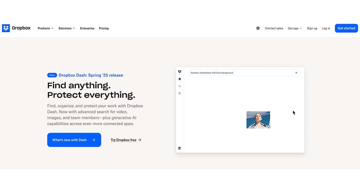
Right when you land, you’re met with a clean layout, a headline that hits the point, and a clear CTA button.
There’s no guessing what the next step is.
That’s how you use fold space with purpose.
Now, compare that to how the same page looked a few years ago.
Back then, things were cluttered, the message was vague, and the CTA was buried below the fold.
It wasn’t bad, it just didn’t make the most of the prime real estate.
After a refresh, their conversion rates improved simply because the most critical elements were placed in the right place.
Another great example is Apple’s product pages.
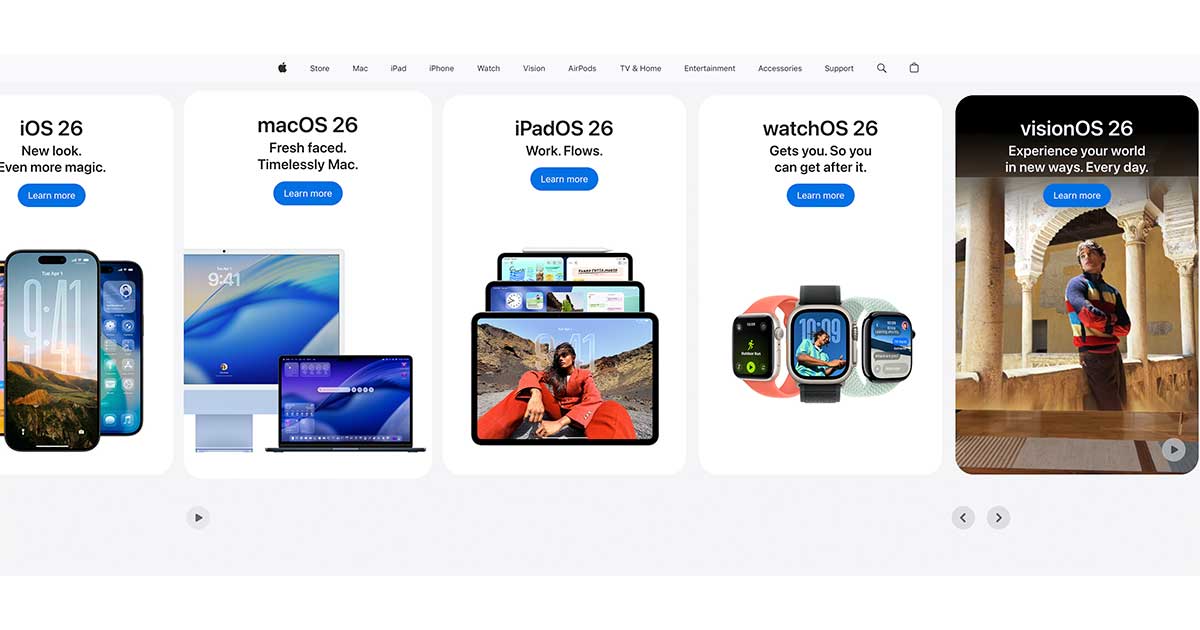
The moment the page loads, you’re hit with bold visuals, minimal text, and an emotional pull that hooks you.
No scrolling needed to feel something.
That’s the power of strong first impressions.
Look at Netflix’s landing page, too.
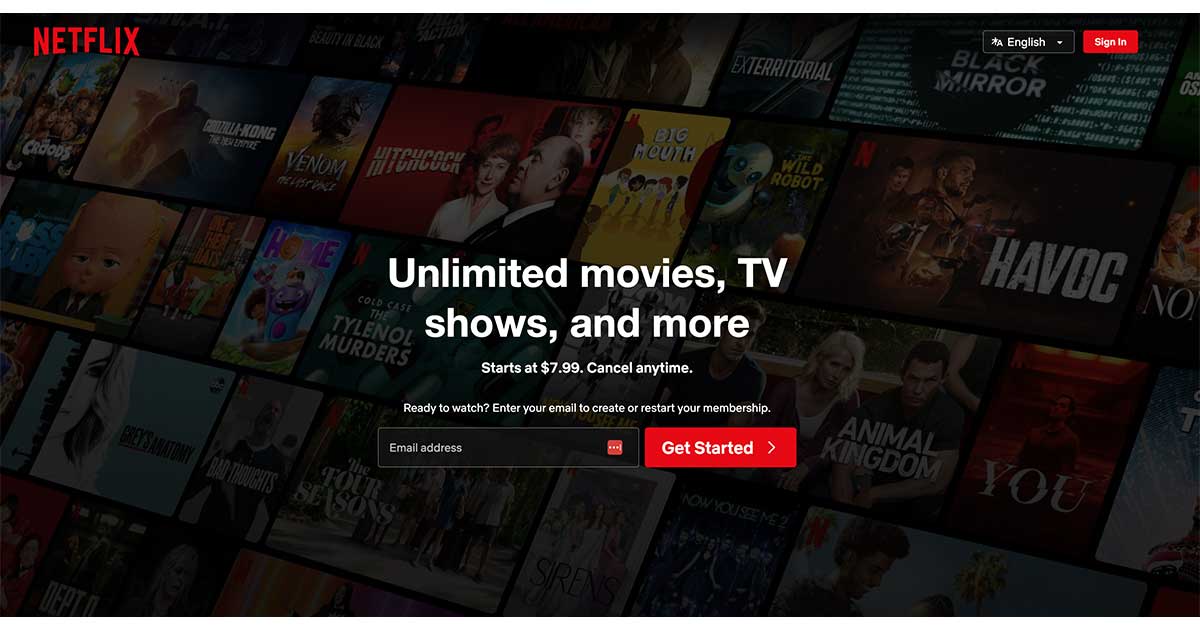
A clear value proposition, concise format, and a prominent red button.
No fluff.
It’s straightforward to grasp and equally simple to execute.
Even Amazon uses fold space smartly.
On a product page, you get the product title, price, reviews, images, and buy options without scrolling an inch.
They know how important that first glance is, because it often determines if you’ll keep browsing or bounce.
This doesn’t just apply to tech giants.
Local businesses and service-based websites can do the same.
Clear headlines, well-placed CTAs, and visuals that resonate with the target audience go a long way, especially on mobile phones where screen space is limited and user behavior is even more impatient.
Final Thoughts
When someone lands on your site, that first view (the part above the fold) is your one shot to say, “You’re in the right place.”
This space should show your value, point to the next step, and spark interest fast.
The best way to do that is by focusing on clarity, simplicity, and intention.
Whether it’s a landing page, product page, or your homepage, the fold area deserves special attention.
Put your most important content right where the eye lands.
Guide your visitor with clean design, strong messaging, and a clear call to action.
That’s what turns a curious click into a serious lead.
If you’re unsure whether your website’s first impression is effective, I can help.
A quick homepage audit or fold-focused review could be all it takes to turn things around.
Let’s explore your site together.
I’ll show you what’s working, what’s missing, and what you can do next.
No fluff. Just straight, actionable advice.
Would you like to start with a complimentary homepage review?
Let’s talk.
We Have Delivered High Quality Websites and Our Customers Are HAPPY!
“Good quality and responsive service. Isaias is a professional person, he is always aware of the needs of his clients. He has always helped me in my projects.”
CEO