Are you trying to design a thank you page for your business website but don’t know how to start?
We’ve gathered 7 great thank you page examples that you can use to get some inspiration.
In addition, we will provide you with information on how to measure the effectiveness of your new thank you page, as well as additional information to clarify some possible doubts you may have regarding thank you pages.
Let’s get started.
7 Thank You Page Examples
Each one of these thank you page examples provides a valuable lesson for improving visitor experience.
If you don’t have the budget to hire professional web design services, this is a good place to start.
Get a FREE Website Consultation
Let us take care of your web design and development needs so you can focus on your business. We can handle new websites, landing pages, website redesign, and even maintenance.
Contact us today to get a free website consultation!
1. HubSpot’s Thank You Page
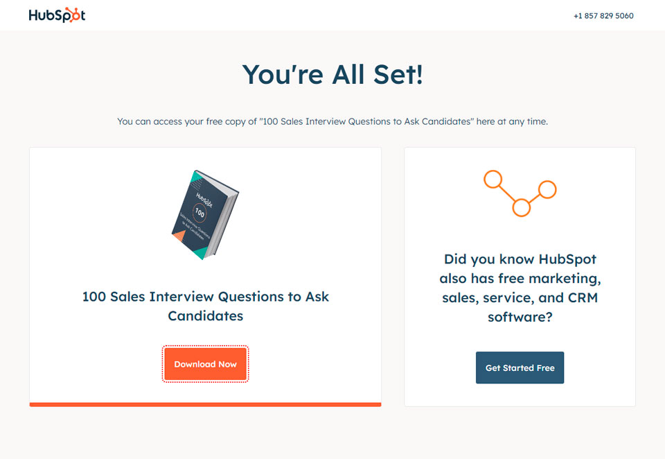
After downloading one of HubSpot’s guides, users are directed to a page that provides two prominent buttons: “Download Now” and “Get Started for Free.”
This encourages users to explore HubSpot’s product offerings.
What makes this thank you page unique is that it not only thanks the user for downloading the guide, but also provides an opportunity to learn more about what HubSpot has to offer.
By offering users the chance to explore their products and services, HubSpot is able to capture more qualified leads, as users who are interested in their content will be more likely to take the next step and sign up for a free trial or request a demo.
Source: hubspot.com
2. Punchbowl’s Thank You Page
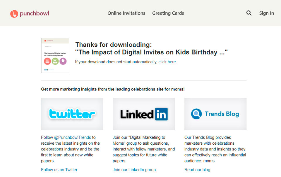
Punchbow’s thank you page highlights the links to their social media profiles and explains what content users can expect from each platform.
By offering insights, tips, and trends related to event planning and invitations, they can build a community of engaged followers who are more likely to use their platform for future events.
Source: punchbowl.com
3. WordStream’s Thank You Page
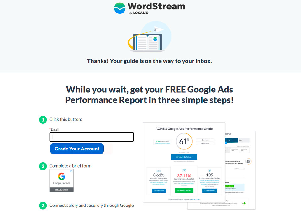
WordStream’s thank you page is extremely simple, with a clear message thanking the user for their interest in their content and informing them that the requested guide is on the way to their inbox.
This straightforward approach ensures that the user feels appreciated and reassured that they will receive the content they requested.
However, what makes this thank you page unique is the additional offer they provide just below the main message.
WordStream offers a free Google Ads performance report in just three simple steps. This is a great method to keep users engaged with their brand and encourage them to keep taking steps into the conversion funnel.
This free report offers immense value to users who are interested in optimizing their Google Ads campaigns, making it a highly compelling offer.
Source: wordstream.com
4. IMPACT’s Thank You Page
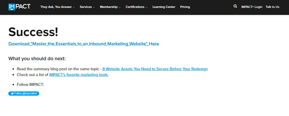
IMPACT’s thank you page takes an extremely simple, yet effective approach to encourage users to stay in touch with the brand, even after downloading a resource.
On this thank you page they provide a download link and just below that, the page has a section called “What you should do next:” where they indicate a few very simple and concise steps for the user to continue to improve their skills through their useful resources.
In addition, they attach a link to their Twitter profile where they provide relevant information about the brand’s identity, purpose, and news.
Source: impactplus.com
5. StoryBrand’s Thank You Page
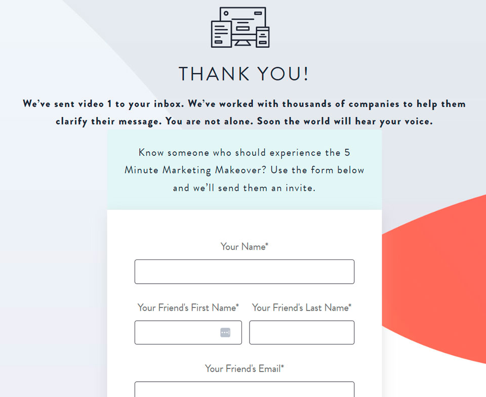
StoryBrand’s thank you page features a simple and clean design that is both user-friendly and aesthetically pleasing.
The page contains a form where users who have just subscribed can enter a friend’s information to invite them to join the experience as well.
The form is prominently displayed and is easy to navigate, allowing for a smooth user experience.
The page’s primary focus is on expressing gratitude and thanks to visitors for their interest in StoryBrand and providing them with a clear next step to engage further with the brand.
Source: storybrand.com
6. Teachable’s Thank You Page
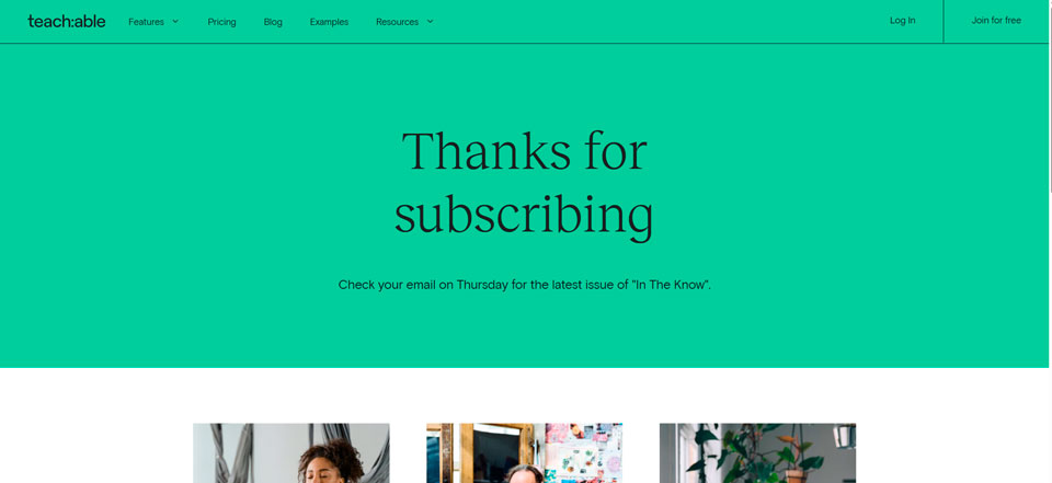
Teachable’s thank you page is a minimalist and effective example. The page features a simple message of appreciation for subscribing to their newsletter.
Additionally, Teachable also includes relevant content, encouraging visitors to explore more relevant tips, or even about their services.
Source: Teachable.com
7. CXL’s Thank You Page
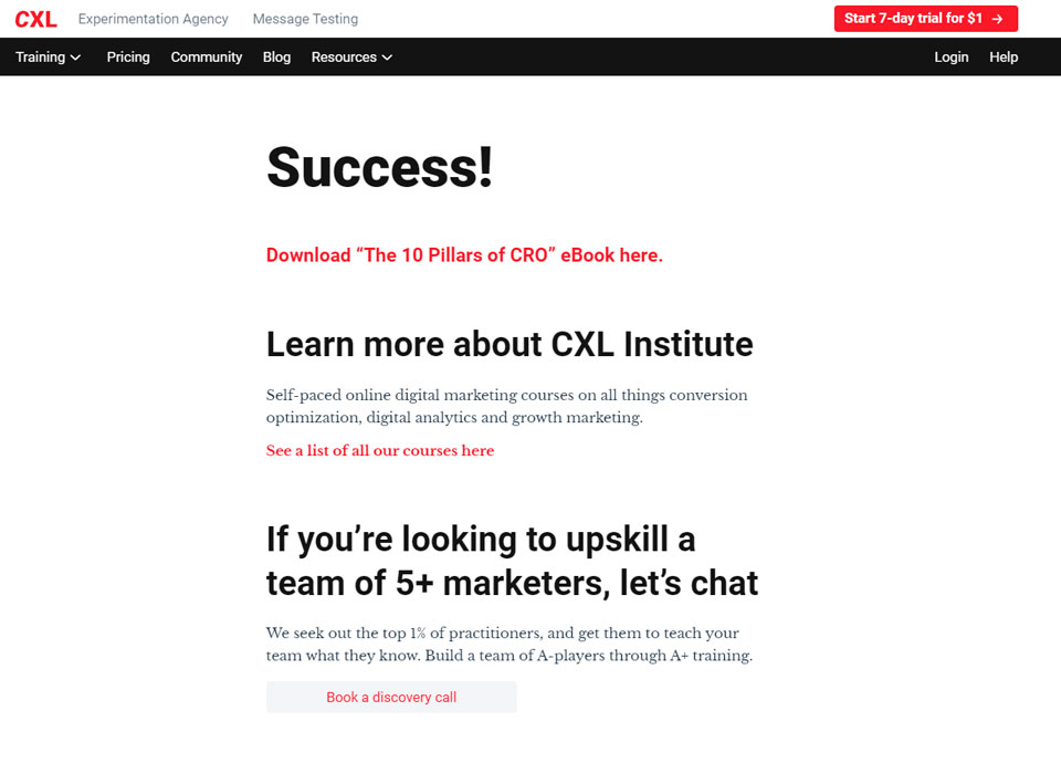
After thanking the user for taking action, CXL provides a link to download a file related to the user’s action, such as an e-book or guide. This download button is placed at the top of the page and is easily noticeable.
After the download button, CXL provides information about their courses. This is a clever way to upsell users who have already shown an interest in the company’s offerings, and it can lead to increased revenue for CXL.
Finally, the thank you page provides a button for booking a discovery call. This call is an opportunity for users to speak directly with a member of the CXL team to discuss their business needs and how CXL can help them achieve their goals.
Source: cxl.com
Benefits of an Optimized Thank You Page
These are a few benefits of having an optimized thank you page.
Avoid Customer Frustration After Ordering a Product
By providing an order summary on the thank you page, customers can quickly identify any errors or discrepancies and contact customer support if needed.
This can save them time and reduce frustration, as they don’t have to navigate through multiple pages to find their order details.
Obtain Customers’ Information
By inviting customers to subscribe to newsletters, receive updates on upcoming sales, promotions, events, or loyalty programs, the thank you page can help online stores maintain a relationship with customers and keep them engaged.
Foster Positive Relationships
By thanking customers for their purchase and expressing appreciation for their trust in the online store’s products, the thank you page can foster a positive relationship between the store and the customer.
What Is the Difference Between a Thank You Page and a Landing Page?
A landing page and a thank you page are two types of web pages that serve different purposes in a marketing funnel.
While both are important elements of a marketing campaign, they have different objectives and features.
A landing page is a standalone web page that is designed to persuade visitors to take a specific action, such as filling out a form, subscribing to a newsletter, or purchasing a product.
The primary objective of a landing page is to transform visitors into potential customers or leads. Typically, a landing page comprises a headline, an explanation of the offer, a call-to-action (CTA) button, and a form that enables the collection of visitor information.
On the other hand, a thank you page is a web page that visitors see after they have completed a specific action on a website, such as filling out a form, making a purchase, or subscribing to a newsletter.
The purpose of a thank you page is to acknowledge the visitor’s action and provide additional information or resources that may be helpful or relevant.
A thank you page may contain a message of gratitude, instructions on what to expect next, or a CTA to encourage further engagement.
How to Measure the Effectiveness of Your Thank You Pages
To ensure that your thank you pages are effective, it’s crucial to measure their performance.
Here’s how to do it.
Use A/B Testing
A/B testing is a widely employed approach to compare two versions of a page and determine which one delivers superior performance.
For example, you can test different headlines, copy, images, or call-to-action buttons to see which version results in more conversions.
A/B testing can provide valuable insights into what works and what doesn’t, helping you optimize your thank you pages for better performance.
Use Heatmaps and Eye-Tracking Tools
Heatmaps and eye-tracking tools can help you understand how visitors interact with your thank you pages.
Heatmaps show you where visitors click, scroll, or hover on the page, while eye-tracking tools track their gaze and attention.
By analyzing this data, you can identify areas of the page that are most engaging or distracting and make changes accordingly.
Heatmaps and eye-tracking tools can also help you optimize the layout and design of your thank you pages for a better user experience.
Use Surveys and Feedback Tools
Surveys and feedback tools can provide valuable insights into how visitors perceive your thank you pages.
You can ask them about their experience, what they liked or disliked, and whether they found the information or resources provided helpful.
Surveys and feedback tools can also help you identify areas for improvement and make changes based on the feedback received.
Use Analytics and Reporting Tools
Analytics and reporting tools can provide a wealth of data on how your thank you pages are performing.
Analytics tools provide so much information that you can get confused pretty quickly. To avoid that it is important to analyze the right metrics.
Asking yourself questions such as “Do I want users to go to a specific page after visiting my thank you page?” or “Do I want users to click on a button or watch a video after visiting my thank you page?” can help you determine what metrics you should analyze.
Additional Best Practices to Enhance Your Thank You Pages
Once a visitor has completed a desired action on your website, the thank you page becomes a powerful tool for continuing the customer journey.
This page is more than just a polite gesture; it’s a great way to increase engagement, boost conversions, and foster long-term relationships.
Here, we will explore additional strategies you can implement to make your thank you pages even more effective.
Adding Social Proof and Testimonials
Integrating social proof is one of the best practices for improving your thank you page.
Adding testimonials, reviews, or case studies from happy customers is a great way to build trust with new visitors or customers.
When a website visitor sees that others have had positive experiences, they are more likely to stay engaged with your brand.
This is especially powerful on ecommerce sites, where customer feedback can directly impact purchasing decisions.
A confirmation message or even a confirmation email is the perfect place to ask for a review or a social share.
Encourage customers to share their purchases or experiences on social media using social sharing buttons.
By offering a special offer like a coupon code for their next purchase, you give them a tangible reason to share their experience.
Offering a Lead Magnet or Additional Resources
A lead magnet is a highly effective way to keep your audience engaged.
Once a visitor has completed a form submission or a purchase, it’s the perfect opportunity to offer them a free download, such as a white paper, free ebook, or any other relevant additional content.
This is especially useful in email marketing, where increasing your email list with new subscribers is a primary goal.
Make sure that these resources are aligned with your visitor’s actions.
For example, if they downloaded a free ebook, offer related products or related content that might interest them.
This additional value not only provides more useful information but also subtly encourages them to engage further with your business.
Use Countdown Timers and Special Offers to Encourage Immediate Action
Implementing a countdown timer on your thank you page can create a sense of urgency and drive visitors to take immediate action.
For instance, offering a discount code that expires within 24 hours after a purchase confirmation page can push customers toward making their next purchase sooner rather than later.
This technique is especially effective on product pages or a checkout page where visitors are already inclined to buy.
A countdown timer can also be used in situations where you want visitors to sign up for a webinar or event.
The last step before they leave the thank you page might be their perfect opportunity to commit to another conversion activity.
Create a Personal Touch
Adding a personal touch is another great way to improve your thank you page.
Whether through personalized messaging or an invitation to connect on social media pages, showing appreciation in a tailored way can enhance the visitor experience.
You can include a contact form for feedback, or add links to your social media icons, ensuring visitors can follow or engage with your brand further.
This is also a great opportunity to include a form submission that collects contact information for your email marketing campaigns.
If you’re using a confirmation email after a purchase or a sign-up, the thank you page is a good example of where to express gratitude and build a relationship with your new customers.
Offering personalized additional resources based on their previous actions ensures that your engagement strategy is aligned with their needs and interests.
Use Analytics to Improve the Customer Journey
Another best practice is to analyze how visitors engage with your thank you pages.
Are they clicking on the related content links you provide?
Are they sharing on social media via your social sharing buttons?
Use these insights to optimize the page for better results.
Incorporating tools like conversion rate optimization can help you adjust elements on the thank you page, such as the call-to-action or the positioning of social media icons, for more engagement.
Consider using A/B testing to determine the best ways to structure your thank you page.
You can experiment with different page examples, like testing various layouts, headlines, or offers.
Minor tweaks, like adding a countdown timer or a different CTA button, can have a significant impact on the page’s performance.
Offering Additional Value at the Last Step
As visitors complete their actions, such as a form submission or a purchase, you can provide additional value by including links to blog posts, case studies, or even exclusive offers for new customers.
Offering these resources at the last step of their interaction ensures you deliver useful, actionable content that meets their needs at the right time.
For example, an ecommerce site could feature recommended products based on the customer’s previous purchase history or the item they just bought.
For business owners running a service-based website, providing a free download like a checklist or case study is a powerful way to keep new leads engaged after the initial conversion.
Clear Instructions and Desired Action
To ensure your thank you page is as effective as possible, provide clear instructions on the next steps you want visitors to take.
Whether it’s subscribing to your newsletter, downloading a free ebook, or filling out a contact form, always make the desired action evident and easy to follow.
A thank you page is the perfect time to reiterate your brand’s value and give specific instructions on what visitors should do next.
The easiest way to keep them engaged is by ensuring they understand the value of staying connected.
If you want them to share their experience, make the social media icons prominent, and include a CTA encouraging social shares.
Integrating Social Media and Social Sharing Buttons
Including social media pages or social media icons on your thank you page is an easy way to encourage visitors to share their experiences or stay connected.
Providing a simple link to your social media pages can boost social shares and increase visibility for your brand.
This is also a great place to provide more ways for your audience to engage with your brand on platforms like Facebook, Twitter, and Instagram.
A good idea is to offer a special offer or discount code that can be shared with friends or family via social media.
This not only encourages current customers to take advantage of the offer but also introduces potential new customers to your brand, extending your reach organically.
The Impact of an Effectively Optimized Thank You Page
Your thank you page is a powerful tool in your overall marketing strategy.
By incorporating these best practices, from offering lead magnets to integrating social proof, you can transform a simple acknowledgment into an opportunity for further engagement.
Remember, every element of the thank you page, whether it’s a confirmation message, a special offer, or related products, should serve the primary purpose of moving your visitor closer to becoming a loyal customer.
By optimizing your thank you page with these strategies, you ensure that you’re capitalizing on the great opportunity to enhance the customer journey and maximize conversions.
The Bottom Line
In conclusion, thank you pages are an essential part of any marketing funnel, helping to foster a positive relationship between a business and its customers.
We recommend you pick a few ideas from the examples we mentioned and then implement them in your thank you pages as soon as possible.
After some time, make sure to analyze the results, and if it is not working the way you expected, then try other concepts.
We Have Delivered High Quality Websites and Our Customers Are HAPPY!
“Good quality and responsive service. Isaias is a professional person, he is always aware of the needs of his clients. He has always helped me in my projects.”
CEO

