
Sometimes, doing less does more.
Minimalist web design isn’t just a passing trend.
It responds to what users want: simplicity, clarity, and ease.
We’re all overloaded with content, tabs, pop-ups, and distractions.
When a site dials it back and gives you exactly what you need, no more, no less, it’s a breath of fresh air.
That’s why minimalist websites have taken center stage in recent years.
They’re easier to navigate and load faster, work better on mobile, and help people focus on what matters.
Whether you’re building a brand or trying to boost conversions, the minimalist approach offers a smarter way to design.
This idea didn’t just appear out of nowhere.
Its roots go way back to the Bauhaus school, where designers believed that form should follow function.
That philosophy made its way into graphic design, interior design, and eventually, how we build websites.
Now, more than ever, web designers are cutting out the noise and embracing cleaner, more purposeful design.
What Is Minimalist Web Design?
Minimalist web design is exactly what it sounds like: a design style that keeps only the most essential elements on the screen.
No fluff, no clutter, no distractions.
Every part of the page has a reason to be there.
At its core, it follows the principles of minimalism, clarity, focus, and purpose.
That means fewer elements, stronger messages, and smarter structure.
Instead of cramming everything in, the design leaves room for users to breathe, to explore, and to see what matters.
Minimalism in web design closely parallels graphic and interior design.
In all three, the goal is the same: strip away what’s not needed so the most important elements can stand out.
One of the most significant influences on this shift has been the emergence of flat design.
Clean lines, simple icons, and a limited color palette replaced 3D buttons and shadowed gradients.
Combining this with sharp typography and a clear layout gives you a website that looks modern and works better.
Minimalist sites aren’t dull.
They’re intentional.
Every design element has a job.
Whether it’s guiding the user’s attention or reinforcing a brand identity, nothing is wasted.
Get a FREE Website Consultation
Let us take care of your web design and development needs so you can focus on your business. We can handle new websites, landing pages, website redesign, and even maintenance.
Contact us today to get a free website consultation!
The Key Elements of Minimalist Websites
The first thing you notice on a minimalist site is the space.
There’s room to breathe.
Ample white space and carefully used negative space give everything clarity.
Instead of overwhelming the visitor, the design gently invites them in.
Next comes the layout.
Minimalist websites often use a simple layout, but simple doesn’t mean basic.
Clear layouts enable users to navigate the site smoothly.
There’s a clear path to follow, which makes the whole experience smoother.
This is especially important for mobile users who rely on a clean interface and intuitive navigation.
Typography also plays a huge role.
Bold typography grabs attention, while clean typography keeps the reading experience easy.
Every font choice matters, as it helps set the tone and guide the eye naturally from section to section.
You might also notice subtle animations sprinkled in, not flashy, just enough to add a touch of life.
These small movements can guide interaction without creating a distraction.
Another key piece is visual hierarchy.
The most crucial content always stands out, whether it’s a call to action, a product image, or a headline.
Designers carefully choose where to place each element so that nothing fights for the user’s attention.
Minimalist landing pages take this a step further.
They cut right to the point, focusing only on what users need to see or do.
Everything revolves around that single goal, whether it’s signing up, making a purchase, or learning more.
Benefits of Minimal Web Design
User experience: Less visual clutter, more ease of use
One of the first things people notice when they visit a minimalist website is how calm it feels.
There’s no chaos, no distractions pulling the eye in ten different directions.
Simply a neat design conveying a straightforward message.
With fewer elements fighting for attention, visitors can focus on what matters.
It’s easier to navigate, quicker to understand, and feels better to use.
That kind of experience builds trust fast.
Faster load times, especially on mobile devices
Every second counts when someone clicks on your site.
If it loads slowly, they’re gone.
A minimalist approach eliminates bloat by avoiding heavy graphics and unnecessary code, ensuring faster page loading.
Especially on mobile devices, that can make or break whether someone sticks around or hits the back button.
Clean design means clean speed.
Better mobile responsiveness for various screen sizes
Minimalist sites naturally lend themselves to mobile-first design.
When you start with the bare essentials, adjusting everything to fit smaller screens is easier.
Buttons are more tappable.
Text is easier to read.
Navigation is simpler.
It works better, whether someone’s browsing on a phone, a tablet, or anything in between.
Higher conversion rates from improved user engagement
The less friction a visitor feels, the more likely they are to take action.
Minimalist design keeps the path clear.
With intuitive navigation and a simple layout, visitors are guided exactly where you want them to go.
The result?
Higher engagement.
More clicks.
Better conversion rates.
Easier for search engines to index and rank effective websites
Search engines love websites that are fast, easy to crawl, and focused on clear content.
Minimalist websites check all those boxes.
With fewer distractions and cleaner code, search engines can better understand your structure, pick up key elements, and reward you with better rankings.
That’s how simplicity turns into visibility.
Why Less Is More
Fewer elements reduce cognitive load.
Whenever a person lands on your site, their brain begins to process the information they see.
If there’s too much going on, it gets overwhelming fast.
A minimalist design helps ease that mental strain.
The brain processes information more efficiently by highlighting only the most essential elements.
That means people stay longer and become more engaged.
Stripping out unnecessary elements sharpens attention
When everything has a purpose, nothing gets lost.
Removing non-essential content helps highlight what’s important.
Call-to-action buttons, product info, key messages; these all take center stage.
This clarity keeps your visitors’ attention exactly where you want it.
Minimalist principles put essential elements center stage
Minimalist websites work because they don’t try to do everything.
They’re focused.
Whether it’s a sign-up form, a product feature, or a story you’re telling, minimalist design makes sure that’s what gets noticed.
Nothing else competes.
That’s what gives your message power.
Every design element is intentional and impactful
There’s no filler in minimalist web design.
If something’s there, it has a job to do.
Whether it’s a bold headline, a subtle animation, or a simple visual element, everything supports the user’s experience.
That kind of precision makes every visit feel purposeful and professional.
Common Features in Minimalist Sites
Minimal design paired with a modern look
Clean lines, flat designs, and carefully selected typefaces give them a modern look.
There’s nothing outdated or clunky.
Just confident design that feels current and sharp.
Strategic use of color schemes and essential features
Colors in minimalist websites aren’t loud or scattered.
They’re used with intention.
A restricted color palette frequently enhances the brand and directs attention.
Features are chosen in the same way.
If it lacks a genuine purpose, it doesn’t cut.
Mobile-friendly structures like the hamburger menu
Navigation needs to be smooth, especially on smaller screens.
That’s why many minimalist sites use the hamburger menu.
It keeps things tidy while still offering access to everything a visitor needs.
Less clutter, more control.
Clean design supports a cohesive brand identity.
Minimalism helps brands speak clearly.
Without distractions, your fonts, colors, and layout form a visual identity that’s easy to remember.
Visitors walk away not just understanding what you offer, but who you are.
The bare minimum as a powerful tool for clarity and connection
Stripping things down doesn’t mean losing impact.
It means amplifying it.
When you cut away the noise, what’s left carries more weight.
A headline hits harder.
A product feature feels more important.
The whole experience becomes easier to connect with and that’s where real results come from.
Case Studies & Examples
Let’s talk results.
Take Dropbox.
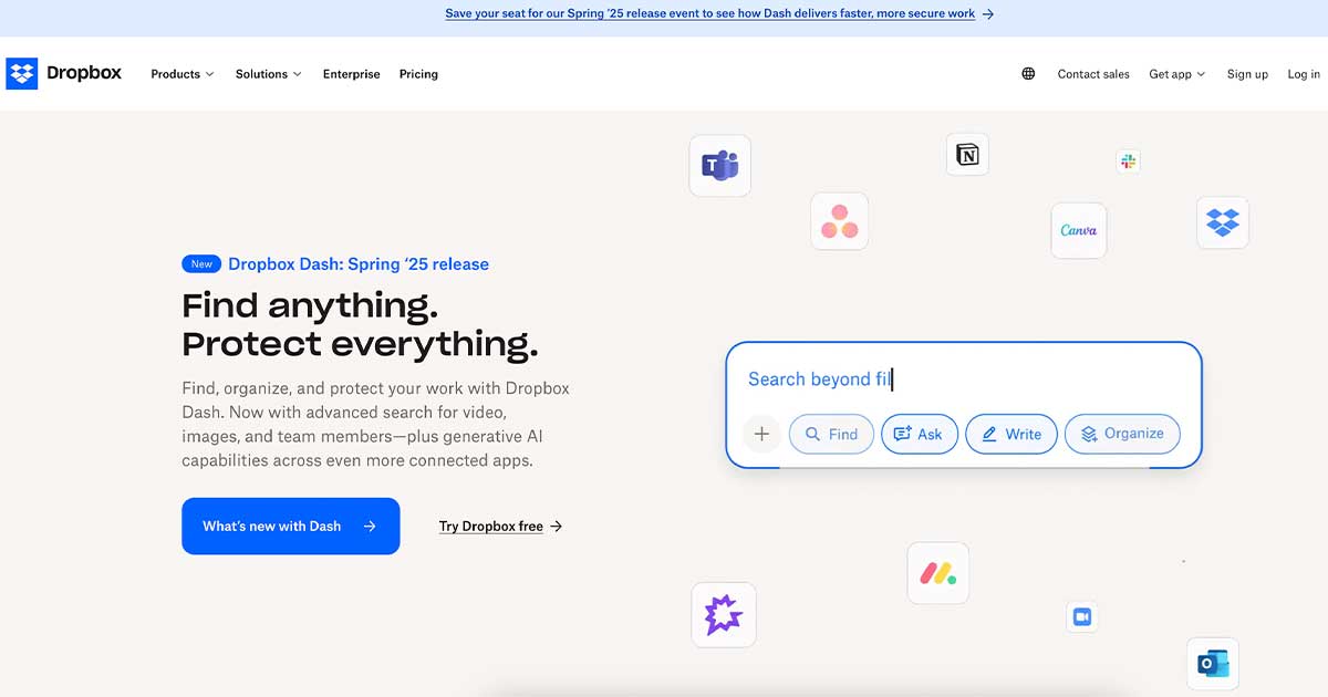
Their home page is a masterclass in restraint.
You land on a simple design with clean typography, ample white space, and just one focal point: a bold headline paired with a clear call to action.
No distractions.
No fluff.
These are just the most essential elements laid out in a way that naturally guides your eyes to what matters.
It’s a minimalist landing page done right, and it delivers.
Users are familiar with Dropbox and know precisely what to do next.
That clarity drives sign-ups.
Next, look at Everlane.
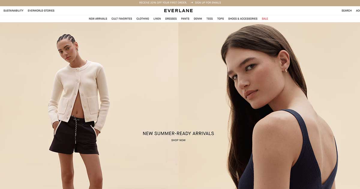
This clothing brand doesn’t just sell products, it sells values, transparency, sustainability, and simplicity.
Their website reflects that with clean layouts, a limited color palette, and subtle animations that never steal attention.
The design choices aren’t about flash.
They’re about building trust.
The home page keeps the message sharp, with just enough visual elements to draw interest without crowding the user’s attention.
The result?
A more powerful brand identity and a more streamlined shopping experience.
Then there’s Framer.
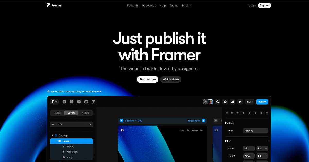
This tool for designers takes a minimalist approach while still feeling high-tech and dynamic.
Their home page employs clean lines and a flat design to maintain a visually light aesthetic, but the bold typography and clever use of white space effectively create a strong visual hierarchy.
The most important content?
Right at the top, paired with an action you can’t miss.
It’s modern design stripped to the essentials, which makes everything faster, smoother, and easier to use, especially on mobile devices.
These sites don’t just look minimal.
They function that way, too.
They load faster.
They convert better.
And they feel like a breath of fresh air in a noisy space.
That’s the power of using fewer elements without sacrificing purpose.
Challenges and Misconceptions
Now, let’s clear something up.
Minimalism isn’t about removing everything and calling it a day.
It’s more than just a logo and a button on a blank canvas.
That’s not smart design.
That’s laziness dressed up as restraint.
One common trap is mistaking minimal web design for something cold or unfinished.
Stripping down a website without a strategy leads to confusion, not clarity.
Visitors shouldn’t have to guess where to click next or feel like they’ve landed on an empty shell.
When minimalism forgets the user, it stops being effective.
Another issue is underestimating your audience.
Not everyone visiting your site is a design geek.
Your target audience wants ease of use, not a design experiment.
This is why clean typography, user-friendly navigation, and straightforward calls to action are important.
You must help people navigate your site without making them think too hard.
That’s the real goal behind minimalist websites.
The secret is in the balance.
It’s about removing what’s unnecessary, not what’s useful.
You still need structure.
You still need hierarchy.
You still need emotion.
Minimalist sites should feel alive, not sterile.
They should focus the user’s attention on the most critical content, not leave them searching for it.
When done right, the minimal design is full of intention.
Every design element has a job.
Nothing is random.
And that kind of clarity?
That’s what drives user engagement and makes the whole experience feel effortless.
Applying Minimalist Design to Your Online Presence
Let’s be honest.
Most websites out there are doing too much.
They’re crammed with flashy banners, pop-ups, five different fonts, and buttons fighting for attention.
That kind of clutter pushes people away instead of drawing them in.
If you want to build an online presence that feels effortless, welcoming, and effective, a minimalist approach is one of the best moves you can make.
Best Practices for Web Designers and Business Owners
Start with the essentials.
Focus on the most critical elements that drive results: your offer, message, and call to action.
Ditch the non-essential elements that only distract.
Use clean layouts, a limited color palette, and just enough visual elements to guide your visitor’s eye.
Envision clean typography, gentle animations, and purposeful white space.
These aren’t just aesthetic decisions.
They’re functional ones.
They keep your user focused, reduce cognitive load, and help create a stronger connection with your brand.
If you’re a business owner, this might mean working with a designer who understands balancing beauty and function.
If you’re a designer, it means resisting the urge to fill every corner of the screen.
Instead, give each section breathing room and let the content speak.
Why Minimal Web Design Is the Best Way to Reach Mobile Users
An increasing number of people are using their phones to browse the internet.
That small display offers no space for superfluous content.
Minimalist sites naturally adapt better to mobile devices because they rely on fewer elements, clean lines, and a simple layout.
With mobile users, speed matters.
Fewer images, cleaner code, and focused content lead to faster load times.
That means lower bounce rates and higher engagement.
Whether you’re targeting shoppers, clients, or readers, a minimalist style ensures they stick around long enough to take action.
Tips for Integrating Responsive Design and Mobile-First Design
First, design for the smallest screen.
That’s where most of your audience starts.
Use scalable design elements and flexible grids so your layout adjusts smoothly to various screen sizes.
Keep buttons large enough to tap and menus simple, think hamburger menu, clear calls to action, and straightforward navigation.
Don’t let mobile responsiveness be an afterthought.
Build it in from the start.
Test your site constantly on different devices, not just your desktop.
And don’t forget fast sites win.
Compress images, use modern code, and remove anything that slows things down.
Starting Points: Crafting a Minimalist Landing Page or Refreshing Your Home Page
If your website is already up and running, you don’t need to begin anew.
Start with one page, which could be your homepage or a landing page.
Cut the noise.
Highlight one focal point.
It could be your offer or your signup form.
Make sure it’s clear and impossible to miss.
Use bold typography to draw attention, keep your message tight, and add the proper visual hierarchy to guide the visitor from start to finish.
A minimalist landing page serves as an effective conversion tool.
You increase clarity and trust by removing visual clutter and focusing on the most essential elements.
And that trust is what leads people to take the next step.
Final Thoughts
Fewer distractions during construction lead to increased focus.
When you give your visitors space to breathe, they stay longer.
You build stronger connections when you present your message with clean aesthetics and user-friendly interfaces.
This style of design doesn’t just work better for users.
It works better for you.
It boosts your conversion rates, improves search rankings, and creates a consistent brand experience across all devices.
Simplicity is powerful.
Especially now, when attention is limited, and screens are small.
If your site feels cluttered or hard to use, it might be time to step back and strip it down to what matters most.
The best websites don’t overwhelm.
They guide.
They serve.
They connect.
And that’s the beauty of minimalist web design, it helps you do more by showing less.
Ready to make a change?
Start with one page.
Keep only the essentials.
Let your design breathe.
Sometimes, the most effective way to stand out… is to remove everything that doesn’t.
We Have Delivered High Quality Websites and Our Customers Are HAPPY!
“Good quality and responsive service. Isaias is a professional person, he is always aware of the needs of his clients. He has always helped me in my projects.”
CEO