Ad copy and the business page typically get the most love on Facebook when it comes to marketing strategies.
However, the call-to-action button is overlooked by many marketers and business owners.
They hold some serious power, and it’s so many people miss out on the chance to make them work for their ads.
It’s a real missed opportunity to drive conversions.
But how to optimize your Facebook call to action buttons to maximize their effectiveness?
What are Facebook CTA buttons and how they work
CTAs are clear prompts on a business page or ad that urge viewers to take action – whether it’s signing up for updates, visiting a website, or making a purchase.
They’re strategically placed on the upper right side of desktop pages or below the cover photo on mobile.
They typically have something that makes them stand out such as a bolder font or in a different color.
That helps with boosting conversion rates.
They are also important for lead generation, helping turn interest into action.
It’s a great way to get people to join your newsletters and gauge interest in your product.
Start Attracting Customers Through Social Media Marketing Today!
We can help you create Social Media Marketing campaigns that attract customers. We work with Facebook, Instagram, Linkedin, Pinterest, and Twitter.
7 Effective Facebook’s Call to Action buttons
Here are seven of the most effective Facebook CTA buttons and their use cases:
1. Contact Us
If potential customers need more information before making a purchase, the “Contact Us” CTA button is your go-to option.
This is particularly useful for businesses that offer bespoke products or services, such as accounting firms or web design companies.
After clicking the button, users can be directed to various contact channels, including live chat, clickable phone numbers for mobile users, or a contact form.
2. Shop Now
For businesses that focus on online sales, the “Shop Now” call-to-action button is a game-changer.
Designed to drive immediate purchases, this CTA targets customers who are ready to buy.
Whether you’re selling products directly from your website or through third-party platforms like Amazon or Etsy, the goal is to streamline the purchasing process.
3. Sign Up
Are you looking to expand your email list and nurture leads?
The “Sign Up” button is your ticket to success.
Encourage visitors to subscribe by offering enticing incentives such as promotional offers or freebies, also known as lead magnets.
Businesses that aim to establish authority within their industry often provide valuable resources like ebooks or whitepapers in exchange for contact information.
4. Watch Video
Sometimes, a picture is worth a thousand words – or in this case, a video!
The “Watch Video” CTA button allows businesses to deliver comprehensive information about their products, services, or brands.
For instance, online course creators often utilize targeted Facebook ads to direct prospects to informative webinars.
Similarly, sellers of physical products can showcase product demonstrations or advertisements to provide potential customers with a deeper understanding of their offerings.
5. Book Now
Ideal for service-oriented businesses, the “Book Now” CTA button facilitates hassle-free appointment scheduling.
Whether you’re a hotel, restaurant, salon, or tour company, this button is tailored to attract customers who are ready to take action.
Once clicked, users can be directed to a third-party scheduling app, a booking page on your website, or even a reservation chatbot.
6. Donate Now
Similar to the “Shop Now” button, the “Donate Now” CTA targets users ready to make online transactions—but with a philanthropic twist.
This button is particularly valuable for charitable organizations or crowdfunding campaigns seeking financial support.
7. Learn More
When potential customers crave additional information before making a purchase decision, the “Learn More” call to action button comes into play.
Whether you’re introducing a new product, service, or company, this button serves as a gateway to deeper exploration.
Redirect users to a dedicated landing page where they can find comprehensive details about your offerings, benefits, and unique selling points.
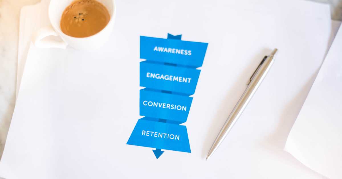
Facebook Ad CTA Options Based on Marketing Funnel Stages

When it comes to choosing the right call to action button for your Facebook ads, it’s essential to consider where your audience stands in the buyer’s journey.
Here’s a breakdown of your options based on the different stages of the marketing funnel.
- For awareness: These buttons are designed to capture the attention of individuals who may not be familiar with your business yet. They serve as the first point of contact, introducing prospects to your brand. Examples include “learn more,” “explore now,” and “get started.”
- For consideration: In this stage, prospects are aware of your business and are exploring the solutions you offer. These buttons help them gather more information and evaluate whether your product or service meets their needs. Options here might include “learn more,” “download,” “contact us,” and “apply now.”
- For conversions: Finally, these buttons are designed to convert leads who are ready to make a purchase. At this point, leads are prepared to buy, and your ad serves as the final push they need to seal the deal. These can include: “Message Us,” “Buy Now,” “Subscribe Today,” and “Sign Up.”
Tips for Optimizing Facebook CTA Buttons
Effective call to action buttons on Facebook can significantly impact your ad’s success.
Here are some tips to ensure your buttons hit the mark:
Know your target audience
Understanding who you’re trying to reach is key.
Make sure your CTA button language resonates with your audience’s needs and preferences.
Whether they’re tech-savvy millennials or baby boomers seeking simplicity, speak their language to grab their attention.
Keep it concise
Less is more when it comes to CTA button text.
Keep your message clear, concise, and action-oriented. Avoid jargon or lengthy explanations.
Instead, use strong verbs that prompt immediate action, like ‘Shop,’ ‘Learn,’ or ‘Discover.’
Promote value, not just products
Focus on the benefits or solutions your product or service offers rather than simply promoting the product itself.
Highlight how your offering can solve a problem or enhance the customer’s life.
This approach attracts attention and resonates with potential customers on a deeper level.
Offer something of value for free
Everyone loves a freebie! Consider offering a valuable incentive to encourage clicks on your CTA button.
Whether it’s a free ebook, discount code, or exclusive content access, providing something valuable can entice users to take action.
This increases engagement, builds goodwill, and fosters trust with your audience.
How to Add Facebook Call-to-Action Buttons

It’s pretty simple to add a CTA to your page or ad:
Adding a button to the Classic Page
- Navigate to your business’s Facebook page.
- Beneath the cover image, locate and click on the “+ Add a button” option.
- Select your desired call-to-action (CTA) button from the provided dropdown menu.
- Follow the on-screen instructions to complete the process.
- Save your changes.
Adding a button to a Facebook Ad
- Go to the Ads Manager on Facebook and start the ad creation process.
- Choose the marketing objective and go on.
- Specify your target audience, ad placements, schedule, and budget before continuing.
- Pick the Facebook page where your ad will be displayed.
- Select the preferred ad format, ensuring compatibility with CTA buttons.
- Upload the required media (video or image) and compose your ad text.
- From the CTA dropdown menu, select the desired action for your button.
- If necessary, provide a website URL to enable the CTA dropdown menu.
- Review the preview of your ad and ensure all details are accurate.
- Once satisfied, proceed to publish your ad.
Advanced Strategies for Maximizing Facebook Call-to-Action Buttons
In the competitive world of digital marketing, Facebook call-to-action (CTA) buttons play a pivotal role in driving conversions and achieving your campaign objectives.
While understanding the basics is essential, diving deeper into the nuances can unlock better results.
Below are advanced strategies and insights to help you craft effective CTAs that truly stand out.
The Psychology Behind a Successful CTA
Creating a compelling CTA goes beyond selecting a button and slapping it onto your ad or web page.
It’s about understanding your target market and leveraging psychology to guide users through their user journey.
For instance, incorporating a sense of urgency, like a limited-time offer, can prompt users to act faster, especially when paired with action words such as “Act Now” or “Claim Today.”
Adding social proof, such as “Join 10,000+ satisfied customers,” builds trust and enhances the value proposition of your product or service.
This not only attracts website visitors but also helps in achieving higher conversion rates.
Designing the Best CTA for Your Audience
When designing CTAs, focus on contrasting colors and placement in strategic locations to make your buttons stand out.
A good CTA doesn’t just look appealing; it draws the audience’s attention to the desired action.
For instance:
- Use a button color that contrasts with the white background of your ad or home page for better visibility.
- Ensure ample white space around the clickable button to avoid visual clutter.
- Test different background colors to determine what works best for your specific audience.
Remember, an effective CTA button doesn’t just rely on aesthetics; it also aligns with your business goals and delivers a clear path to the next step.
Leveraging A/B Testing for Optimal Results
One of the best practices for improving CTAs is A/B testing, where you compare two versions of a Facebook ad campaign to see which performs better.
Test elements such as:
- CTA copy: Experiment with action words like “Sign Up Now” versus “Get Started Today.”
- Button color: Does a green button yield more click-through rates than a red one?
- Secondary CTA options: Test adding a free trial alongside a “Learn More” button.
Analyzing the data from A/B tests provides valuable insights into what resonates with your prospective customers and ensures your campaign meets its marketing objectives.
Action Words: The Key to a Persuasive CTA
The wording of your CTA significantly influences its effectiveness.
Strong, action-oriented examples include words like “Discover,” “Start,” “Claim,” or “Explore.”
These verbs grab the user’s attention and create a clear path to action.
Consider this good example: A “Claim Your Free Guide Now” button feels more actionable than a vague “Learn More.”
The former uses an action verb that speaks directly to the user’s intent, making it a persuasive CTA.
Different Types of CTAs for Varied Campaign Objectives
Depending on your campaign goals, you’ll want to explore different types of CTAs to meet specific needs.
Below are some great examples:
- E-commerce sites: Use “Shop Now” to drive direct purchases or “Get 10% Off” to highlight discounts.
- Service-based businesses: Include a “Call Us” button for phone calls or “Schedule a Demo” for consultation bookings.
- Content-heavy websites: Encourage engagement with “Download Your Free Guide” or “Watch Webinar.”
- Social media campaigns: Opt for CTAs like “Follow Us” or “Share This Post” to boost brand awareness.
Each CTA should align with your main goal and provide a clear path for the user to follow.
CTAs on Mobile Devices: Key Considerations
Since many users interact with Facebook via mobile phones, optimizing your CTAs for smaller screens is non-negotiable.
Here’s how to ensure your CTAs perform well on mobile devices:
- Keep the text simple and concise for better readability.
- Position the clickable button where it’s easy to tap without scrolling.
- Use specific action examples like “Tap Here to Start” to clarify what users should do.
These adjustments improve the user experience and help drive higher conversion rates.
Boosting CTA Effectiveness with Added Value
Providing valuable information or incentives is a best way to enhance your CTAs.
Examples include:
- Offering a free trial of your service to encourage sign-ups.
- Sharing a free guide packed with valuable insights to showcase your expertise.
- Emphasizing a time-sensitive promotion to instill urgency.
These tactics don’t just improve engagement; they also build trust with your audience.
Common CTA Mistakes to Avoid
While crafting a successful CTA, avoid these pitfalls:
- Vague language: Be specific, “Start Your Journey” is more explicit than “Get Started.”
- Overcrowding: Too many CTAs can overwhelm users. Stick to one primary action.
- Poor placement: A buried CTA won’t perform well. Always place it in strategic locations visible to users.
You’ll ensure a more effective marketing campaign by steering clear of these mistakes.
The Future of CTAs: Personalization and AI
As technology evolves, CTAs are becoming more personalized.
AI-driven tools can analyze user behavior and tailor CTAs to individual preferences.
For example, an e-commerce site could use AI to display a “Buy Now” button for returning visitors or a “Learn More” button for first-time users exploring the site.
This customization improves user experience and leads to better outcomes.
By implementing these strategies, you can take your Facebook CTAs to the next level.
Whether your goal is to boost click-through rates, increase brand awareness, or drive sales, these advanced tips will help you craft CTAs that deliver exceptional outcomes.
Conclusion
A Facebook CTA is a powerful tool in your sales and marketing campaigns, so don’t overlook it.
With these tips and strategies in mind, you’re ready to get more conversions and close more deals.
Our Social Media Marketing Services Have Helped Our Clients Increase Their Revenue!
“I highly recommend Brimar if your looking to grow your online business. You will be satisfied with the high level of expertise and high quality of services. It has helped my business grow by leaps and bounds.”
CEO
